Here is another card using FCD's Christian Innies and Outies and Butter/ Dragonfly. I also used one of FCD's fabulous Swirly Sets. This one is retired, but she has lots of other sets that are just as beautiful. To create the frame, I stamped the bottom swirly. I used one of my Spellbinder oval dies as a template and after figuring out a good placement, I lightly traced the oval shape using a pencil. I used the top of the penciled oval to help with placement of the swirly along the top. Then I placed the Spellbinders Oval down again, and used a Micron 05 to draw the portion of the oval I wanted for the frame. Then I used a white eraser to eliminate the pencil lines.
I want to show you a little butterfly trick as well. See the bottom of the post.
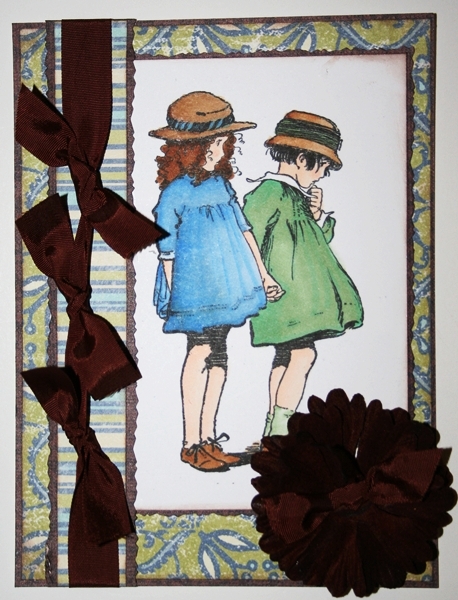
Paper Flower Tutorial #1
The lighter blue blooms are by Prima and I made the navy ones using punches. I used to tell my friends all the time, that if you have flower punches, then you always have matching flowers for your projects. I love Prima, but I can't always afford to buy them. I bought these flower punches years ago, and I can't tell you how many times they have come in handy. The ones I'm showcasing today are by Paper Shapers. Tomorrow I will be showcasing another kind of paper flowers so stay tuned.

For today's paper flowers I used the Daisy punch in 2 different sizes. I think mine are the small and medium. Mine are both green, but I bought them years ago, so EK Success may have changed the color by now. Here is a photo :

Punch 2 for each flower. And then adhere together in the center, rotating the top layer so that the petals are staggered. And don't forget to fluff them!

You can leave them as you see them, but they look even better if :
1. You layer the small in the center of the larger one.
2. Ink the edges with black ink using a eye shadow applicator.
or doodle around the edges with a fine tip (005) Micron pen.
3. Embellish the center with stickles, 1/2 pearls, gems, or little buttons.
Butterfly Trick
Next I want to share with you a creative way to get the most out of a butterfly images.
I am using my Butterfly/Dragonfly stamp set for this one. The butterfly image is a full spread of the wings. But for this particular design I thought it would look better with a side view of the butterfly and some dimension.


Start by stamping the butterfly twice.

Color the same side of the the wings depending on which way you want it to face. Color the body as well.

Cut out as shown below with my preference, cuticle sissors. Anytime I'm cutting small curved area's I find the cuticle sissors much easier to use.

Fold/crease along the side of the body, so that the wing pops up off the page. You will actually be adhering it to the page along the body. Stagger the wings so that the bottom on is visible.
Thanks for tuning in today! I will be back tomorrow with another Paper Flower Tutorial!